With the mass amount of emails hitting your inbox each week, it’s no wonder getting your open rates up consistently often feels like an uphill battle. Let’s be honest, how many sales emails do you read all the way to the bottom each week? Probably not many.
So, how do you win the never-ending email battle if you empathize with the sentiment that is creating the problem (there are just too many emails to read them all). While there are several factors to consider when you develop an email strategy, we’re going to focus on one specifically in this blog: email design trends.
If you think back to the last email where you arrived at the footer, it probably had more substance than just a good subject line. It was likely designed really well, too. Here are some email design trends you should be trying in the B2B marketing world today.
Less Text = More Eyeballs 👀
Have you ever opened an email only to find a giant wall of copy, so you close it as quickly as you can as if it were physically suffocating you? Yeah, we’ve all experienced that feeling.
According to research published by Microsoft in 2015, the average human attention span is 8 seconds. The attention span of a goldfish is 9. It is now 2020 and we’ve had an additional five years of text messages, 280 character tweets, and a deluge of Netflix mini-series to further shorten our already suffering ability to focus.
To further the complication, everyone already shuffles through a number of emails daily, so when we open up our inbox we’re typically trying to get to the point of the email as quickly as possible. We’re busy people, right? So are your customers, especially those decision makers you are trying to get your product or service in front of.
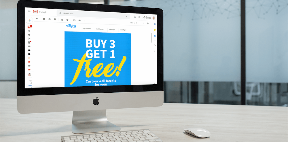
Next time you craft an email, try taking a step back in the amount of copy and place an eye-catching image – possibly with some bold, simple typography – right at the top that gets straight to the point.

Oh, you’re having a sale on wall decals? Cool!
This was an email we created for a B2C client, but the idea can work just as effectively for your business. You have a stat on how your software can streamline time-management and increase productivity? Slap that bad boy right at the top of your email in a well-designed fashion and you’ll have a much better chance at increasing the time your potential client will spend scrolling through.
The Drop Shadow Is Back
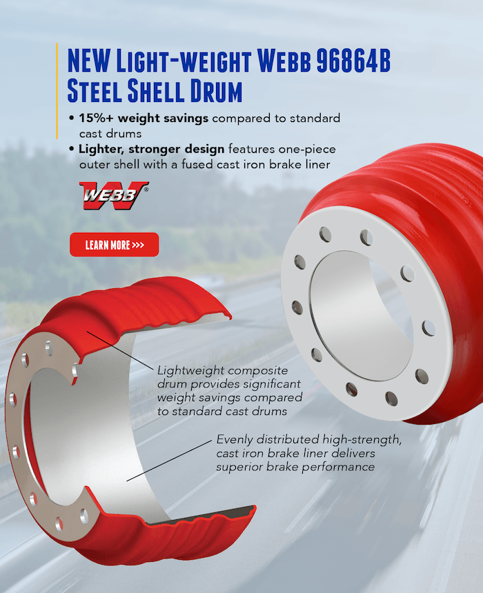
Okay, so maybe not specifically the drop shadow, but 3D imagery is definitely in the forefront of email design trends today. Why? With video games and virtual experiences becoming exceedingly more popular and realistic, the desire for a completely immersive experience in general is increasing daily.
While you can’t have someone bumping around in VR goggles just to read your email, you can use 3D style imagery to make it immediately pop out and attract their attention as soon as they click to open.
Here is a portion of an email we recently designed for a client. Rather than typing out a paragraph about what makes their product special, the 3D style design gave an inside look at the part itself.

Put Your Best Mobile Foot Forward
According to EmailMonday, “mobile email will account for 26 to 78% of email opens, depending on your target audience.”
*Cue descending whistle …
You can see why making sure your emails are mobile-friendly is incredibly important. In terms of design, you’ll want to make sure that any text within images is large enough to read on a phone. Furthermore, using less copy as described in our first tip will also be helpful because you are trying to get your information across on a much smaller screen than a desktop.
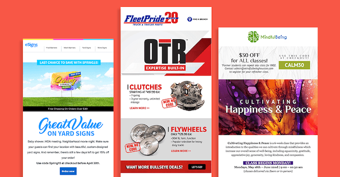
If you’re including multiple products or subjects within the same email, you’ll want to be sure that your segments are short and the email flows well in its entirety. The viewer will be scrolling through with their thumb and ideally they won’t have to do an excessive amount of scrolling to finish a complete thought.

Here are some email designs we’ve done recently with mobile in mind that show clear, defined sections with bold typography anchoring where we want the viewer’s eye to focus. In all three of these designs, you get the first important chunk of information along with its details without ever having to scroll.
Don’t Figure It Out On Your Own
Digital marketing changes daily and email design trends are ever-evolving depending on style, new and improved forms of communication, and sometimes just simple software updates that affect deliverability. It truly takes a village… or a marketing agency to determine the best strategy to market your small business.
Don’t try to figure it all out on your own! Let our experienced marketing team help you come up with an effective, sustainable plan for your business.


